

Lighting That Makes a Commercial Feel Intentional
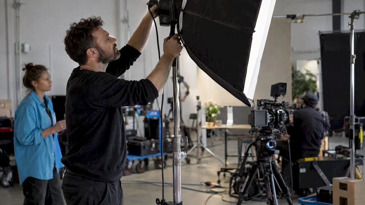
When a marketing lead tells me a spot should feel cinematic, I do not begin by pulling a fixture list. I ask what the audience should notice, trust, or feel before the message is complete. Lighting has to answer those questions before it can look polished.
On my sets, the strongest images usually come from a simple visual decision carried through every shot. A product can feel precise, a person can feel approachable, and a location can feel premium without making the frame complicated. The work is in deciding what deserves attention and what should quietly recede.
That is especially important for a Dallas brand working across broadcast, web, social, and sales presentations. The look has to survive different screens and edits while still feeling like the same brand.
Start with the audience, not the equipment
I first translate the brief into a visual behavior. A wellness brand may need soft transitions and gentle shadows. An automotive campaign may need defined edges, changing highlights, and a stronger sense of motion. A technology company may benefit from clean separation and controlled reflections rather than an obviously dramatic look.
Those choices tell me how light should behave. I may use a broad source that wraps around a face, or I may place a narrower source to carve a product edge. I may let the background fall away, or I may give the environment enough shape to support the story. The fixture follows the intention.
This is where a Dallas commercial director adds value early. I can discuss the emotional target with the marketing lead, then turn it into decisions a cinematographer, gaffer, production designer, and colorist can execute consistently.
Give every highlight a reason to exist
Good commercial lighting guides the eye. It does not illuminate everything equally. I usually establish one dominant source and build the rest of the scene around its logic. If a window appears to motivate the light, the direction, softness, and falloff should support that idea. If a practical lamp is visible, its influence should feel believable even when the main source is positioned elsewhere.
For people, I watch the shape of light across the eyes, cheekbones, and wardrobe. For products, I watch the edges, labels, textures, and surfaces that communicate quality. A bright background can be useful when separation is needed, but it can also steal attention from the product. A small adjustment to the angle of a flag or the position of a subject can solve that without adding another light.
I often use negative fill to remove unwanted bounce. That can make a face more dimensional or give a dark object a cleaner outline. The goal is not maximum contrast. The goal is intentional contrast.
Product surfaces need a separate strategy
Glossy packaging, glass, polished metal, food, and liquid do not show the fixture itself in a simple way. They show the room around it. That means I study the reflection before I decide how bright the source should be.
For a bottle, I may create a long, controlled reflection that follows the form from top to bottom. For a metal component, I may shape a narrow highlight that reveals the contour while keeping the rest of the surface quiet. For food, a broad source can preserve texture and moisture without turning every surface into a white patch.
I build these decisions into the shot plan instead of hoping to fix them later. When the camera moves or the product rotates, the reflection changes. I mark the useful positions, photograph the setup, and communicate what must remain consistent as the angles change.
A Dallas cinematographer has to think beyond exposure here. The image must make the object legible, desirable, and faithful to the brand. That requires observation as much as equipment.
Make the look repeatable across the day
Commercial schedules often move from a hero setup to detail shots, talent coverage, alternate framing, and short-form cutdowns. The lighting language cannot reset emotionally every time the camera changes position.
Before I roll, I identify the elements that define the look:
- The direction and character of the primary source
- The relative density of the shadows
- The color relationship between subject and background
- The key reflections that make the product recognizable
- The practical elements that motivate the scene
I capture reference frames from each major setup and note the positions that matter. These references help me return to a look after a lens change, a wardrobe adjustment, or a location move. They also give the colorist a clear visual target rather than a vague instruction to make the footage feel cinematic.
That discipline matters when I work as a Dallas videographer on a campaign with multiple deliverables. The social version may be tighter, the website edit may breathe longer, and the sales cut may emphasize a different feature. The images should still belong to the same visual world.
Use atmosphere and optical effects with restraint
Haze can make a backlight visible and add depth to a dark environment. It can also soften contrast everywhere, reduce clarity, and create continuity problems when the density changes between takes. I use it when the beam is part of the idea, not simply because it is available.
The same principle applies to filtration and in-camera texture. A subtle highlight bloom or controlled flare can help an image feel tactile, but it should support the brand rather than announce a technique. I prefer to test those choices with the actual lens, product, wardrobe, and background. A monitor may suggest that an effect is elegant, while the finished image reveals distracting glare around a logo.
Testing also exposes problems early. A practical may flicker. A colored source may contaminate skin. A reflective surface may reveal the camera or crew. Those discoveries are far easier to solve before the shooting day is committed to a full sequence.
Turn lighting into a marketing asset
A useful lighting plan does more than make one frame attractive. It creates visual rules that can extend across a campaign. The same edge treatment, color relationship, or shadow behavior can connect a hero film to product stills, vertical edits, and landing-page content.
During preproduction, I ask marketing leads to identify the visual elements that should become recognizable over time. Is the brand warm without feeling soft? Technical without feeling sterile? Premium without becoming distant? Those answers influence location choices, art direction, lensing, and the way I shape light.
I also confirm delivery requirements before the setup is designed. A composition built for a wide master may not protect the subject in a vertical crop. A subtle highlight may disappear after compression. A dark background may look rich in the grade but lose separation on a phone. Directing the shoot with those outcomes in mind protects the message after the set is gone.
My practical pre-shoot questions
Before I direct, I want clear answers to a short group of questions:
- What should the viewer notice first?
- What emotional quality should the brand own?
- Which surfaces, people, or details must remain accurate?
- What changes between the hero film and the cutdowns?
- Which visual choices need to repeat across the campaign?
The answers become a lighting map, not a generic checklist. They help me decide where to spend time, which tests are necessary, and where simplicity will produce a stronger result than additional equipment.
Let’s shape the visual language
If you are planning a commercial or branded film in Dallas–Fort Worth, talk with me about the project. I can help connect the message, location, talent, and lighting approach before the first setup reaches the set.

Alex Kinter is a film and commercial director with over 17 years of experience. He has directed for major brands like Hublot, AT&T, and Mercedes-Benz, and has earned recognition and accolades at international film festivals. Alex's unique approach to storytelling will elevate your brand and connect with your audience. Contact us today and book Alex for your next project here.